
Table of Contents
Overview
Recart's popup editor gives you a wide range of styling options built in. If you want to go further — adjusting spacing, fonts, colors, borders, animations, or layout in ways the visual editor doesn't cover — you can do this using the Custom CSS field inside the popup builder.
This article explains what's possible, which popup elements you can target, and where to learn more.
Where to Find the Custom CSS Field
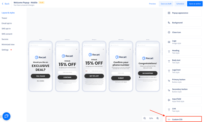
There are two places you can add CSS to a popup. The general Custom CSS field sits at the bottom of the right-hand settings panel, and anything you put there applies across the whole popup.
On top of that, most individual elements have their own Custom CSS box — click into a text block, input field, button, link, or logo on any step and you'll find one in that element's settings. Those styles affect only that element, and they won't appear in the general field.
General Custom CSS — applies to the whole popup
The Custom CSS field appears on every step of your popup flow, but it's one shared field. Whatever you paste in on one step applies to all of them, so you only need to add it once.
To access it:
- Go to Opt-in Tools → Popups
- Open the popup you want to customize
- In the right-hand settings panel, scroll down to find the Custom CSS field
- Once you click on it you'll see all your available options
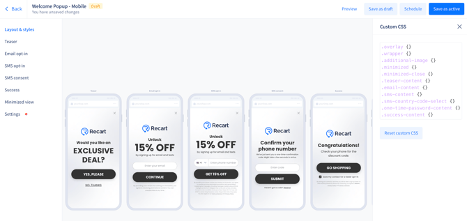
- Paste your CSS into the field — it will be applied on top of the popup's default styles
Element-level Custom CSS — applies to one element
Click any element on a step and its settings panel will include a Custom CSS box. Paste the properties straight in — you don't need a selector, just the properties themselves.
This works across most of the popup: a headline or body text block, the email or phone input field, the submit button, the button on your Success step, links and more.
Styling an element this way affects only that element, so it's the right place for one-off tweaks that shouldn't carry across the rest of the popup.
Note: The Logo section under Layout & Styles is slightly different: it has two boxes, Container custom CSS (the position and spacing of the logo block) and Image custom CSS (the image itself).
What You Can Customize
Here are the main things you can control using Custom CSS:
- Fonts — font family, size, weight, style, and text alignment
- Colors & backgrounds — text color, background color, opacity, and gradient backgrounds
- Spacing — margin (space outside an element) and padding (space inside an element)
- Size — fixed or percentage-based width and height
- Borders — thickness, color, style (solid, dashed, dotted), and rounded corners
- Shadows — drop shadows on elements
- Animations — effects like hover color changes or blinking text
- Positioning — adjusting element placement within the popup layout
Common Use Cases
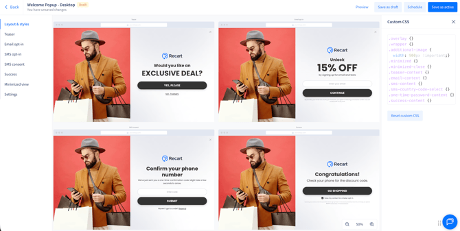
Example 1 — Resize or reposition the additional image (desktop)
What it does: Adjusts the size, position, and opacity of the additional image on your popup.
When to use it: When the built-in Left / Right / Top placement gets the image close but not quite right — for example the image sits too high, needs to be wider, or should sit further back behind the text.
Add an additional image first under Layout & Styles → Popup appearance → Additional image (recommended size: at least 750x1080px), then target it in the Custom CSS field:
.additional-image { width: 900px; } → makes the image wider
.additional-image {   height: 50%;   opacity: 0.5;

margin-top: 130px; }
→ adjusts the height, lowers the opacity, and shifts the image down
Use margin, width, height, and opacity to fine-tune, in pixels (px) or percentages (%), until the image looks balanced.
Example 2 — Keep the logo in a fixed position across all steps
What it does: Pins the logo to an exact position instead of letting it move with the rest of the content.
When to use it: When the logo shifts between steps because each step has a different amount of content, and you want it to stay in one place throughout the flow.
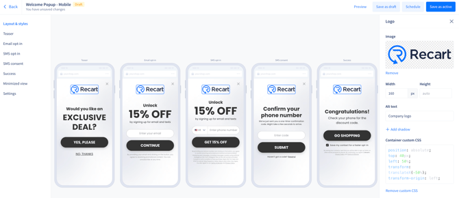
This one goes in a different field: open Layout & Styles → Logo and paste into Container custom CSS. You don't need a selector here — just the properties:
position: absolute; top: 80px; left: 50%;
transform: translateX(-50%); transform-origin: left;
Adjust top to move the logo up or down.
Note: To remove this later, always click Remove custom CSS. Deleting the text by hand will stop the popup from saving.
Example 3 — Change where the popup sits relative to your theme (z-index)
What it does: Controls whether the popup appears above or below other elements on your store, like a sticky header, navigation menu, or cart drawer.
When to use it: When your popup and a theme element overlap — either the theme element covers part of the popup, or the popup covers something that should stay on top.
By default the popup sits above everything else on your store. If you need it to sit behind a particular element, lower its z-index:
.overlay { z-index: 400; }
 .wrapper { z-index: 400; }
To find the right value, right-click the overlapping element in your store, choose Inspect, and check its z-index. Start low (around 3) and work upwards until the overlap clears — on most stores the workable range is 1–100.
Learning More About CSS
If you're new to CSS or want to explore more properties and options, W3Schools is a free, beginner-friendly resource with examples for every CSS property.
If you have any questions or need support setting up Custom CSS for your popup, feel free to reach out to us at support@recart.com — we're happy to help.