Opt-in Tools- Popup Best Practices
Learn how to optimize your Popups to engage more visitors and increase your opt-in rate.
Table of Contents
- Before You Get Started
- Content
- Design
- Layout
- Targeting
- Compliance
- Teaser Step
- Delays
- In Popup Confirmation
- A/B Testing
- Exit Intent Popup
- What to Avoid
With Recart’s Popup editor, you can easily build high-converting, fully customized Popups. Create a design that resonates with your brand and your customers, set up the targeting and the placement, and boost your engagement rate. Read further to learn more tips and tricks to make the most out of your customer’s experience.
Before You Get Started
Important Note:
To ensure a smooth subscriber experience, make sure you always have both a OneClick popup and a regular Welcome popup active at the same time.
- If a visitor clicks “This isn’t me” on the OneClick popup, they will automatically be shown your active Welcome popup to start the opt-in process from scratch.
- ⚠️ If no standard Welcome popup is active, the visitor will not see any opt-in option and will be redirected back to your site without subscribing.
What should you pay attention to while building your Popup?
Content
Have a clear offer.
- Make it clear what your visitors will get in return for subscribing to your text list.
- Normally we recommend offering a discount code.
- The value of the discount you provide is totally up to you. Based on our experience discount code is the best offer you can provide, but alternatively, you can offer free shipping or a gift product in return for the subscription.
Design
Make it appealing.
- Use your brand’s colors and add your logo.
- Make sure to use good-quality background images or GIFs. The recommended minimum size for an image:
-
Desktop Lightbox popup: 600x600px
-
Desktop Fullscreen Popup: 1920x1080px
-
Mobile Popup: 375 x 812px
-
- Pay special attention to the visibility of the text on your Popups.
- If you add a background picture, make sure there it is in high contrast with the text.
- The same applies to your Call-to-Action button.
- You can edit the color of the text and the button, but in case the background picture’s colors or patterns are too strong and make your text invisible, you should edit the picture you upload or choose another one.
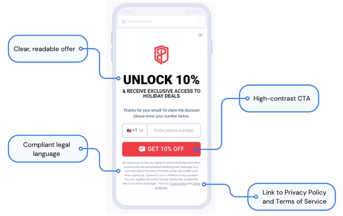
TIP: Keep your Popups’ look and offer updated according to the latest season or most popular holiday.
Layout
Find the best fit for your customers.
- With Recart’s Popup editor, you have multiple options to customize the layout and the size of the Popup.
- It is up to you if the whole Popup or only the minimized version should be the default tool to be displayed.
- You can also choose between full-screen and lightbox Popups, depending on what your customers find more attractive.
TIP: Fullscreen popups have proven to increase conversion rates!
Possible Mobile Popup layouts:
+(1).gif)
Possible Desktop Popup layouts:
.gif)
Targeting
Make it relevant.
- Visitors coming to your website via mobile and desktop might be interested in different content and design.
- Additionally, if you have multiple landing pages, you might want to provide various offers to your visitors.
- No problem, with Recart you can create as many Popups as your business needs.
- Set up your Popups separately for desktop and mobile visitors and if you create multiple Popups for one device, make sure to use the page targeting feature. 👇
- If you have the same targeting setup for the same device the Popups will interfere which is not a great user experience.
-
Set the popup to remain hidden for the entire user session after they visit designated URLs, reducing redundancy and potential annoyance for returning visitors.

Compliance
Keep to the rules.
- SMS is a highly regulated channel and is subject to different rules and regulations, including the TCPA, the CAN-SPAM Act, and the CTIA Guidelines.
- These regulations cover opt-in compliance and being compliant when it comes to SMS marketing is crucial in order to avoid lawsuits and expensive penalties for violations.
- For this reason besides the above-mentioned points such as a clear offer, high contrast text, and Call-to-Action button, it is crucial to have a compliant legal text that links to your Privacy Policy and Terms of Service.
- The default legal text is 100% compliant and we do not recommend modifying it. The store name and the legal documents’ links will be added automatically.
- Learn more about text marketing compliance in this article.
Teaser Step
Ask for additional permission.
- The teaser step allows your customers to first answer Yes or No to a discount offer before being asked to add their contact information.
- Although an extra step seems counterintuitive, we highly recommend turning this step on, as testing has shown an increase in overall conversion rates with the Teaser in place.
- You can edit the teaser by:
-
-
Adding an image
-
Editing your headings
-
Adjusting the color, background, border, and placement of the confirm and decline buttons

-
Delays
Add a delay to your popup.
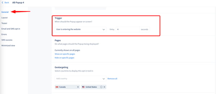
- From experience, our Customer Success Managers have found that adding a delay of 4-6 seconds to your popup produces the best results.
- If your opt-in traffic is high, we suggest running A/B Testing (see more information below) to determine how many seconds works best for your customers eg: 0 vs 5 vs 10 sec.
In Popup Confirmation
Streamline opt-ins.
- Boost your conversion rates effortlessly by offering customers a secure and convenient two-factor authentication opt-in experience.
- With In Popup Confirmation, customers receive a unique code via SMS, adding an extra layer of security without complicating the opt-in process.
- Increase trust, reduce friction, and watch your conversions soar with this easy-to-implement solution.
Learn more about how to activate the In Popup Confirmation opt-in feature.
A/B Testing
Test various popup layouts against one another.
- A/B testing is a valuable tool for optimizing user engagement and conversion rates. It involves presenting two or more versions of a popup to different segments of your audience and analyzing the performance of each variant.
- This allows you to determine which popup design, content, or call-to-action resonates best with your target audience, leading to informed decisions that enhance the overall user experience and maximize desired outcomes, such as increased sign-ups, sales, or other conversions.
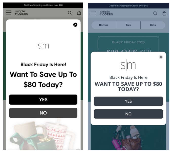
Learn more in our Popup A/B Testing article.
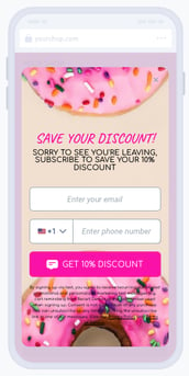
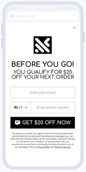
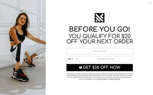
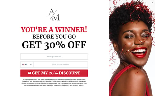
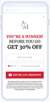
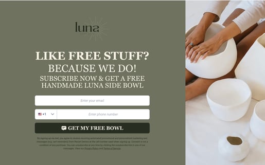
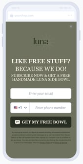
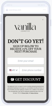
Exit Intent Popup
Grab subscribers before they leave.
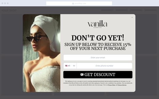
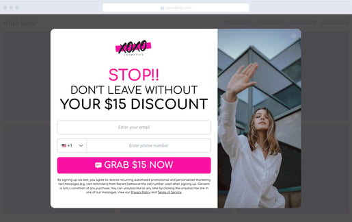
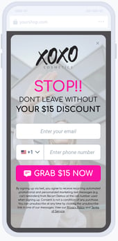
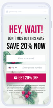
- An Exit Intent Popup is an attention-grabbing display that appears on a user’s screen when a website detects that they are about to leave.
- When implemented effectively, exit intent popups provide great value to businesses and their customers.
- They are perfect for boosting conversion rates, and give you one more chance to turn abandoning visitors into subscribers and paying customers!
Here are some examples to get inspired by! 💡✨
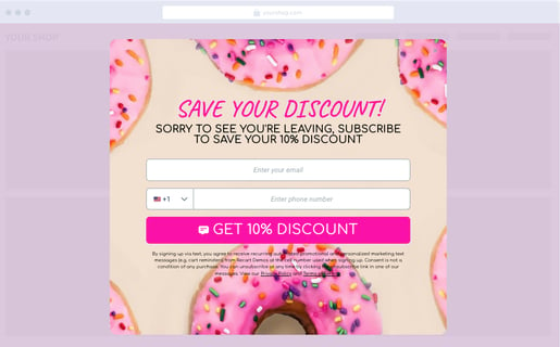
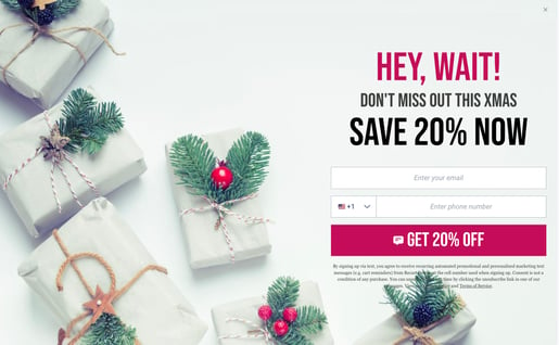
Learn more about how to create your own Exit Intent Popup.
What should you avoid when building your Popups? ❌
Now that the best practices are covered, let’s see the list of common mistakes you should avoid, to make sure your Popups will convert as many visitors as possible.
✖️ Text is not visible or covered by the background image
✖️ There is no offer, or it is not clear in return for the subscription
✖️ Background image or logo is bad quality, blurry
✖️ You have multiple Popups on the same URL
✖️ Your legal language is not compliant
✖️ Your legal documents are not linked
Are you ready to start building your Popups and populating your subscriber list?
Check out our article that provides further information about creating new Popups.
If you have any remaining questions, do not hesitate to contact the Customer Support team.